Mobile-First Design Basics for Small Businesses
More than 60 percent of web traffic now comes from mobile devices, and for local service businesses that number is often even higher. When someone searches for "emergency plumber near me" at 9 PM, they are almost certainly on their phone. If your website does not work well on a mobile screen, you are invisible to the majority of your potential customers.
Mobile-first design is not just a buzzword or a trend. It is the fundamental approach of designing your website for phone screens first, then scaling up for tablets and desktops. Google uses mobile-first indexing, which means the mobile version of your website is what determines your search rankings. A site that looks great on desktop but fails on mobile will rank poorly, regardless of how good the desktop experience is.
What Mobile-First Actually Means
Traditional web design starts with the desktop version and then tries to squeeze it down to fit smaller screens. Mobile-first flips that approach. You design for the smallest screen first, focusing on the most essential content and features, then add elements as screen size increases.
This approach forces you to prioritize. On a phone screen, there is no room for unnecessary sidebars, decorative elements, or walls of text. You have to decide what truly matters to your visitors and put that front and center. The result is a cleaner, more focused experience on every device.
Key Elements of Mobile-Friendly Design
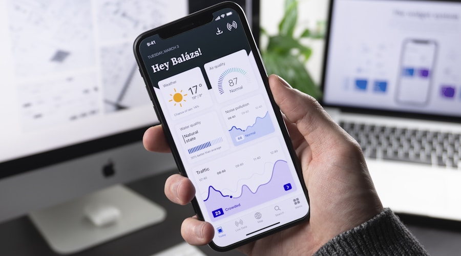
Responsive layout. Your website needs to adapt automatically to any screen size. This means using flexible grids, scalable images, and CSS media queries that rearrange content based on the viewport width. A responsive site uses a single set of code that works everywhere, rather than a separate "mobile version" that has to be maintained independently.

Touch-friendly navigation. Menus designed for mouse clicks do not work on touchscreens. Dropdown menus that require precise hovering are impossible to use with a finger. Mobile navigation should use a hamburger menu or similar pattern that expands to show the full navigation when tapped. Menu items need enough spacing between them so users do not accidentally tap the wrong link.
Readable text without zooming. If visitors have to pinch and zoom to read your content, your site is not mobile-friendly. Body text should be at least 16 pixels on mobile devices. Headings should be proportionally larger. Line height and paragraph spacing should give the text room to breathe on a small screen.
Tap targets with adequate size. Buttons, links, and form fields need to be large enough to tap accurately with a finger. Google recommends tap targets be at least 48 pixels by 48 pixels with adequate spacing between them. Tiny links crammed together cause frustration and mis-taps that drive visitors away.
Fast loading on cellular connections. Mobile users are often on slower connections than desktop users. Large images, heavy scripts, and excessive plugins that are barely noticeable on a fast connection can make your site painfully slow on a phone. Optimize images, minimize code, and test your load times on a throttled connection to see what your mobile visitors actually experience.
Common Mobile Design Problems
Horizontal scrolling. If any element on your page forces the user to scroll sideways, your layout is broken on mobile. This usually happens when images or tables are wider than the screen or when fixed-width elements do not adapt to narrower viewports. Every element on your page should fit within the screen width without overflow.
Unplayable media. Videos embedded from certain sources may not play on mobile browsers. Flash content, which somehow still exists on some sites, does not work on any modern mobile browser. Test all media elements on actual mobile devices to ensure they play correctly.
Forms that are painful to complete. Mobile forms need special attention. Use the correct input types so the right keyboard appears (number keyboard for phone fields, email keyboard for email fields). Make fields large enough to tap easily. Minimize the number of required fields because typing on a phone is slower and more error-prone than on a keyboard.
Pop-ups and interstitials. Google penalizes sites that show intrusive pop-ups on mobile devices. A full-screen pop-up that is easy to dismiss on desktop can be nearly impossible to close on a phone. If you use pop-ups, make sure they are small, easy to dismiss, and do not cover the main content on mobile screens.
Testing Your Mobile Experience
The best way to test your mobile experience is to actually use your website on a phone. Open every page, try every function, and complete every task a customer would need to do. Can you find the phone number quickly? Can you fill out the contact form without frustration? Does the site load in under three seconds?
Beyond manual testing, use Google's free tools to evaluate your mobile performance. Google PageSpeed Insights analyzes your site and provides specific recommendations for mobile improvement. Google Search Console shows you any mobile usability issues that might be affecting your search rankings.
Test on multiple devices if possible. An iPhone and an Android phone can render the same site differently. What looks fine on one device might have layout issues on another. If you do not have access to multiple devices, browser developer tools allow you to simulate different screen sizes, though this is not as reliable as testing on actual hardware.
The Mobile-First Checklist
Run through this list to evaluate your current mobile experience. Phone number is clickable and prominently displayed. Navigation works smoothly with touch input. All text is readable without zooming. Buttons and links are easy to tap. Images scale properly and do not overflow. Forms are simple and use correct input types. Pages load in three seconds or less. No horizontal scrolling on any page. Pop-ups are either absent or easy to dismiss. Contact information is accessible from every page.
Mobile-first design is not about making sacrifices for phone users. It is about building a focused, efficient website that works perfectly on every device. Get the mobile experience right, and the desktop experience will follow naturally.